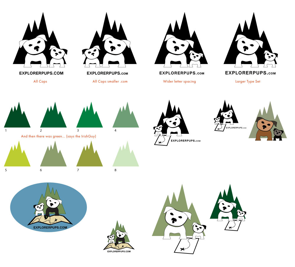
Many prior sketches were made in drawing the dogs - the posts here pick up on most the main design elements have been designed - with a need for balance and unite between the elements. Hope you enjoy.
Early logo ideas - working on color sections - the objective is to bring together four main elements - which at this point of the project I am having a difficult time bringing all of the elements together without it feeling to busy and overwhelming.
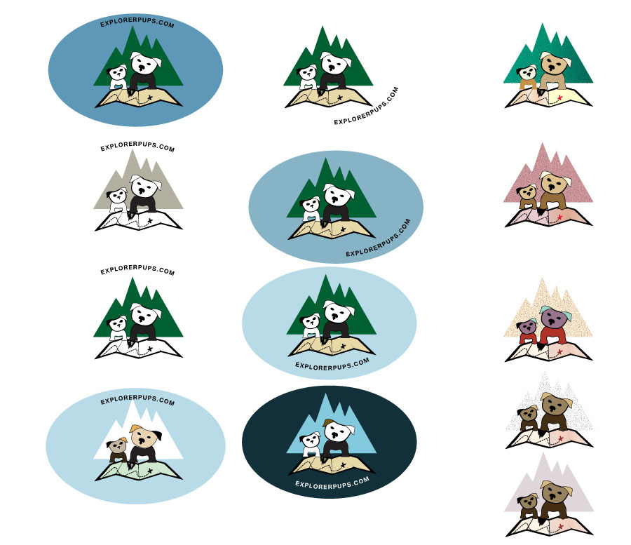

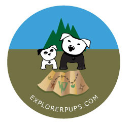
The doggies get an upgrade - each now sport the company name tag - have toes, cast a shadown (neck and ears) and have some added depth to the eyes and nose (large dog).
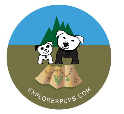
New map design - still unsure how to bring all elements together.
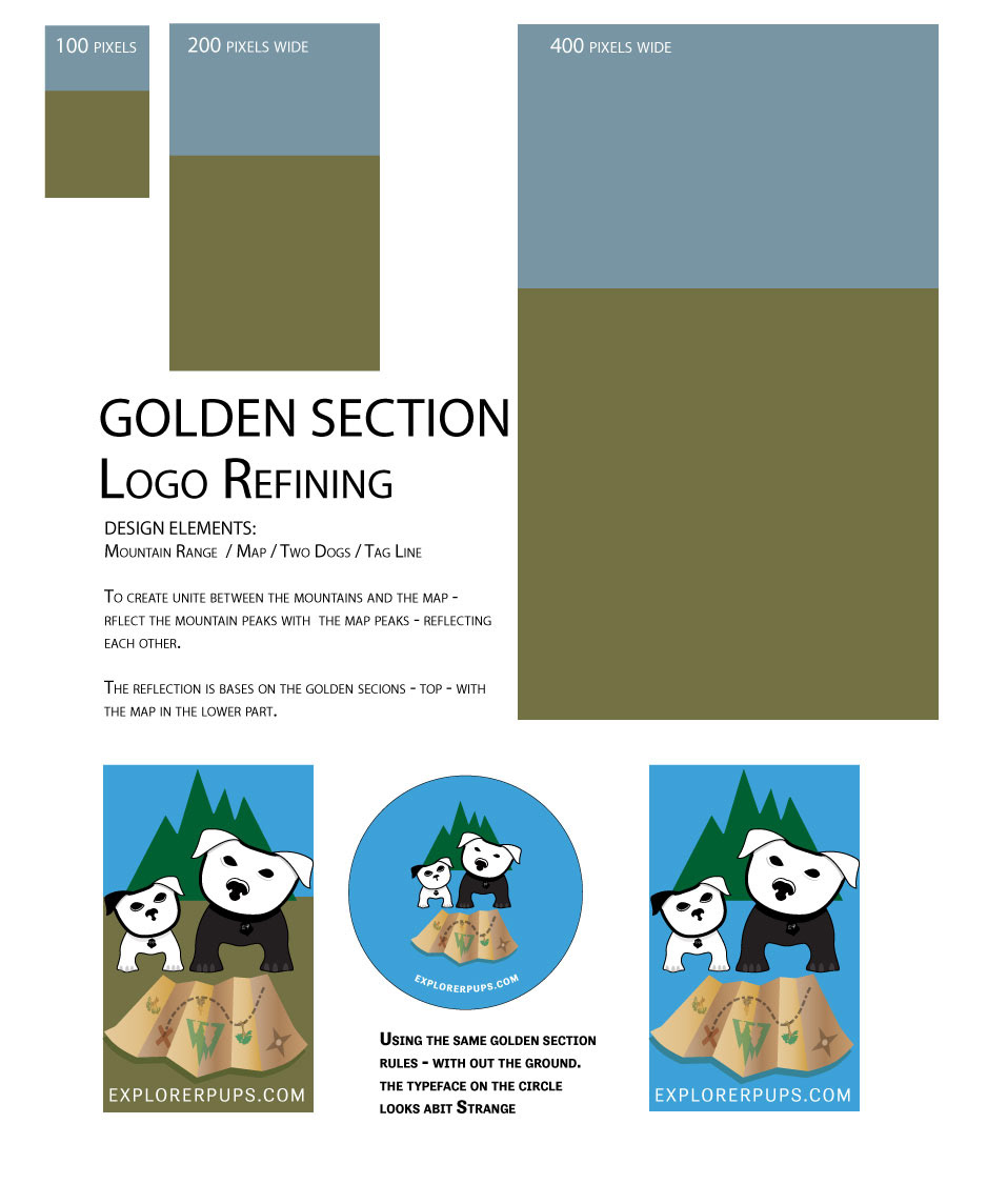
To help reslove my problem of creating balance and order with all the elements - I am calling on the help of the Golden Section. The sections help to control how the elements were scaled to one another. Help create the unite that has felt missing.
I also reflected the mountain peaks with the folds of the map - to create a reflection between the two elements. And connecting the "we are go" there... statement...
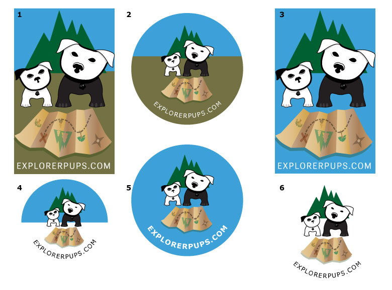
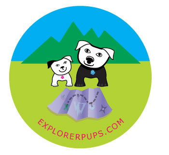
Following the same Golden Section rules - I created varations of the same idea.
While there are quite a few elements to the logo -
Have posted on online for feedback - and look forward to refining the design to the final logo.